Supply Chain Risk Mapping: Visualizing Your Vulnerabilities

Are you tired of being blindsided by disruptions that seem to come out of nowhere? Effective supply chain risk mapping is the specific solution you need to transform hidden vulnerabilities into a clear, actionable roadmap. While general supply chain mapping tells you who your suppliers are, risk mapping overlays critical data points to show you exactly where your network is most likely to break. We are going to get straight into what works, what does not, and exactly what you should do to protect your operations.
You probably already know that visibility is important. Most professionals recognize that knowing their Tier 1 suppliers is a basic requirement. However, this focused breakdown is for those who need to go beyond the basics. We are moving past simple diagrams and into the realm of risk visualization that actually supports high stakes decision making. Let us get specific about how you can build a map that does more than just sit on a shelf.

The Critical Difference Between Mapping and Risk Mapping
When it comes to supply chain risk mapping, many people confuse it with simple supply network mapping. A standard map is a diagrammatic representation of locations and flows. It identifies who is in the chain and where they are located. This is a vital first step, but it is not the finish line. Risk mapping takes that foundation and adds layers of probability and impact.
Think of a standard map as a blueprint of a house. It shows where the walls and doors are. A risk map is like an inspector’s report that highlights where the wiring is faulty or where the foundation is cracking. For a complete overview of how this fits into your larger strategy, check out our main guide on the supply chain risk management framework. The goal is to see the network through the lens of potential failure.
The practical takeaway is that you cannot manage what you cannot see. By layering risk visualization over your physical supply chain, you identify concentration risks, such as having three different Tier 1 suppliers all sourcing a raw material from the same Tier 2 factory. This visibility allows you to prioritize your resources where they are needed most rather than trying to protect everything equally.

Step 1: Scoping and Data Collection
Before you draw a single line, you must define your scope. Are you mapping a single high margin product or your entire enterprise? For most companies, the best move is to start with a single product family that represents a significant portion of revenue. This keeps the project manageable while delivering immediate value.
Data collection is the most labor intensive part of the process. You need more than just names and addresses. You need details on capacity, lead times, and financial stability. According to guidance from the UK National Cyber Security Centre, mapping is essential for understanding who supplies critical services and where sensitive data flows. This means your data collection should include digital dependencies alongside physical ones.
- Supplier Self-Assessments: Use structured questionnaires to gather baseline data from Tier 1 partners.
- Site Visits and Audits: Verify claims through direct observation, especially for high risk locations.
- Transactional Data: Analyze purchase orders and shipping documents to uncover sub-tier links.
- External Databases: Use third party tools to pull ESG scores and financial health indicators.
Here is the thing most people miss. Your Tier 1 suppliers might not know their own sub-tiers perfectly. You often have to work collaboratively with them to trace the chain back to the raw material source. Your next step is to incentivize this transparency through your contracts and supplier relationship management programs.
Step 2: Identifying Specific Risk Categories
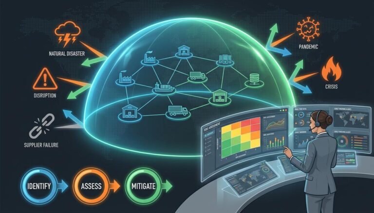
Once you have the data, you need to categorize the threats. Effective risk identification involves looking at both internal and external factors. We suggest breaking these down into specific “buckets” so you do not miss anything critical. Let us look at this closely.
Geopolitical and Logistical Risks
Geopolitical risks include trade wars, sanctions, and political instability. Mapping supplier locations allows you to overlay country level risk indicators. For example, if a cluster of suppliers is located in a region with rising tensions, your map should flag this immediately. Logistical risks involve port congestion, infrastructure quality, and transport reliability. You can find more detail on this in our focused post on geographic supply chain risk.
ESG and Regulatory Compliance
Modern supply chains face intense scrutiny regarding environmental, social, and governance issues. Vulnerability mapping in this area helps you identify “hotspots” where forced labor or environmental damage is more likely to occur. This is no longer just a PR issue. It is a legal requirement in many jurisdictions. Your map should highlight suppliers in regions with weak labor laws or high pollution levels.
Operational and Financial Risks
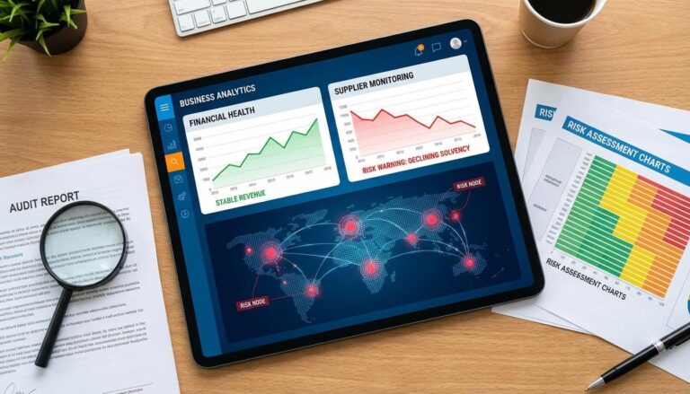
Internal operational risks include single source dependencies and quality control issues. Financial risk is equally dangerous. If a critical supplier goes bankrupt, your entire production line could stop. This is why supplier financial risk monitoring should be a core layer of your risk map. The direct answer to avoiding surprises is to update this financial data at least quarterly.

Step 3: Assessment and Prioritization
Not every risk is worth your time. If you try to mitigate everything, you will exhaust your budget and accomplish very little. This is where supply chain risk assessment becomes vital. We recommend using a structured framework like Failure Mode and Effects Analysis (FMEA) to score risks based on three factors: Likelihood, Impact, and Detectability.
The real question is: what happens if this node fails? You need to calculate the Time to Recover (TTR) for each critical supplier. If a factory burns down, how long will it take to qualify a new source? If the answer is six months and you only have two weeks of inventory, that is a high priority risk. The practical action item here is to plot these scores on a risk heat map.
- High Likelihood / High Impact: Immediate action required. These are your “Red Zone” risks.
- Low Likelihood / High Impact: Requires a contingency plan, such as pre-qualified alternative sources.
- High Likelihood / Low Impact: Manage through operational buffers like safety stock.
- Low Likelihood / Low Impact: Monitor, but do not over invest in mitigation.
Research from NIST highlights that mapping is the first stepping stone for prioritizing these actions. Without the map, you are just guessing which risks are the most dangerous.
Step 4: Creating the Risk Heat Map
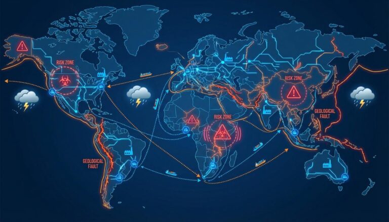
Visual representation is what makes this data usable for executives. A spreadsheet with 500 rows is not a map. A true risk heat map uses color coding to highlight critical nodes and geographical clusters of concern. Red usually indicates high risk, while green indicates stability.
Here is what that actually looks like in practice. Imagine a global map where your supplier locations are marked. You then layer on a weather data feed. Suddenly, you see that four of your critical components are produced in a region currently entering peak hurricane season. This is actionable intelligence. You can decide to pull forward orders or increase safety stock before the storm hits.
Let us get into the details of what your dashboard should show. It should not just be a static image. It should be a dynamic tool that allows you to “drill down” into specific suppliers. When you click on a red dot, you should see exactly why it is red. Is it because of their financial health? Is it a cyber vulnerability? Or is it because they are the only company in the world that makes that specific part? This is the detail that changes everything.

Step 5: Moving from Visualization to Mitigation
The map is a means to an end, not the end itself. Once you have visualized your vulnerabilities, you must take action. Here is the step by step breakdown of how to use your map to build resilience. Your best move here is to start with your single points of failure.
Dual or Multi-Sourcing: If your map shows a “choke point” where all paths lead to one supplier, you need to find an alternative. Even if the second source only provides 20 percent of your volume, it keeps the relationship active and allows for a rapid scale up if the primary source fails. This reduces your exposure to single site dependencies.
Geographic Diversification: If your map shows all your suppliers are in the same earthquake zone, you are not truly diversified, even if you have multiple suppliers. True resilience requires sourcing from different tectonic plates or different geopolitical regions. Use your map to identify these clusters and deliberately seek out partners in different locations.
Buffer Strategies: For risks that you cannot eliminate through sourcing changes, you must use inventory. Your map tells you where the longest lead times and highest risks are. These are the specific nodes where you should hold safety stock. This is much more efficient than holding extra inventory across the entire chain. The practical takeaway is that the map helps you put your money where the risk actually lives.

Quick Reference: Supply Chain Risk Mapping at a Glance
- Purpose: To identify, assess, and visually represent vulnerabilities across the network.
- Key Components: Supplier locations, sub-tier dependencies, material flows, and risk overlays.
- Primary Tools: GIS software, SCRM platforms, risk heat maps, and supplier dashboards.
- Core Risks: Geopolitical, financial, ESG, cyber, and operational failures.
- Action Steps: Scope, collect data, assess impact, visualize, and mitigate.
- Frequency: Continuous monitoring is required as supply chains are dynamic and change constantly.
Common Questions About Supply Chain Risk Mapping
What is the difference between supply chain mapping and risk mapping?
The answer is the addition of data layers. Supply chain mapping is the basic “who and where” of your network. Risk mapping adds the “what if,” layering on probability and impact data like financial health or natural hazard exposure to identify specific vulnerabilities.
How do we get data for suppliers beyond Tier 1?
This is a common challenge. You should combine supplier questionnaires with transactional data like bills of lading. Many companies also use specialized digital discovery tools that use AI to “crawl” through public records and shipping data to map out sub-tier relationships automatically.
How often should our risk map be updated?
A static map is a dangerous map. The short version is that you should update your map whenever a significant change occurs, such as onboarding a new supplier or a major geopolitical event. For high priority products, real time monitoring of risk feeds is the industry gold standard.
Is risk mapping only for large corporations?
Not quite. While large firms have more resources, small and medium enterprises (SMEs) are often more vulnerable to a single supplier failure. For an SME, focusing on the top five critical components and mapping them to the raw material source is a high impact, low cost way to start.
Final Steps for Your Strategy
Supply chain risk mapping is not a one time project. It is a fundamental shift in how you view your business. By moving from reactive firefighting to proactive visualization, you give your team the time they need to make smart choices. You are no longer guessing where the next problem will arise. You are looking at a dashboard that tells you exactly where to focus your attention.
The practical takeaway is simple. Start small. Pick your most critical product and map it through to the second or third tier. Once you see the hidden dependencies and clusters of risk, you will wonder how you ever operated without this visibility. For more help building a structured approach to these challenges, remember to refer back to our comprehensive supply chain risk management framework. Your next step is to gather your procurement and logistics leads to define your first pilot project scope. Let us get to work.